Designing Interactive Tesching Tool

OVERVIEW
As a Product Designer at BenQ (a multinational consumer electronics company), I was responsible for designing interactive teaching tools within the EZWrite software. I conducted competitive analysis on 6 interactive teaching software solutions and designed 3 interactive teaching tools, including wireframes, interface design, and user flows.

COMPANY

BenQ Taiwan

TOOL

Figma

TEAM

1 Product Manager, 1 Engineer

DURATION

3 weeks

Background

EZWrite is a software developed by BenQ, it empowers educators to enhance the learning experience and promote student engagement. EZWrite provides features like interactive whiteboard tools, real-time annotation capabilities, multimedia integration, and cloud-based storage for lesson materials.

However, the teaching tools within the EZWrite interactive whiteboard software did not fully meet the interactive teaching needs of K-12 teachers. Teachers expressed that the existing teaching widgets in EZWrite lack interactivity.

In this project, our goal was to design highly interactive teaching tools. These tools would enable teachers to enhance interaction with students and create diverse learning environments, addressing the needs of kindergarten and elementary school students.

DEFINING PROBLEM

Low Interactivity and Engagement
For teachers, capturing students' attention during lessons is of paramount importance, particularly when dealing with younger students, such as elementary school children. However, the teaching widgets in EZWrite that exhibit low levels of interactivity. This poses a challenge for teachers to effectively engage students and capture their attention using EZWrite.

The current tools within EZWrite can be categorized into two types: static tools with low interactivity and mildly dynamic tools. Static tools include features like protractors and rulers, while mildly dynamic tools encompass features like stopwatches, timers, and randomizers.

EXPLORING SOLUTIONS

Conducting Competitive Product Analysis
After defining the usability issues with EZWrite, I joined teacher communities on Facebook to gain insight into the teaching tools commonly used by educators. I conducted competitive analysis on six educational products.
Creating Teacher Personas
To design the teaching widgets for teachers, I developed personas representing educators. These personas helped me better empathize with teachers' perspectives and understand the challenges they might face during instruction.
Defining Design Principles
The following principles are what I complied when I was designing the new experience:
Wireframing
I created wireframes and discussed potential design directions with the team members. Given that the interface design was intended for a large screen on an interactive electronic whiteboard, it took multiple iterations to plan an interface that could be easily operated either through touch on the interactive large screen or with a mouse on a computer screen.

DESIGN DELIVERABLES

After multiple discussions with the team, I designed three interactive teaching widgets: Multi-purpose Dice, Spin Wheel, and Spotlight.

Multi-function Dice

The Multi-purpose Dice encompasses three functions and can roll up to four dice simultaneously. Teachers can utilize this dice tool in various subjects. For instance, in math class, teachers can use general dice for addition and subtraction exercises, while in English class, they can use text dice for spelling games.
General dice have one to six dots on different sides. Text dice default to English letters, and users can customize the text or images.
By clicking on the settings icon at the bottom right corner, users can change the text or image on the dice.

Spinner Wheel

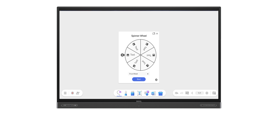
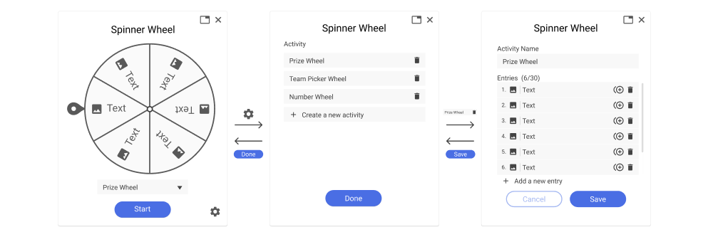
In the Spinner Wheel widget, up to 30 different items can be set on a wheel. Users can add text or images and apply them across various subjects. For example, an English teacher can input vocabulary words and have students create complete sentences using the words selected by the wheel.
Spotlight Tool

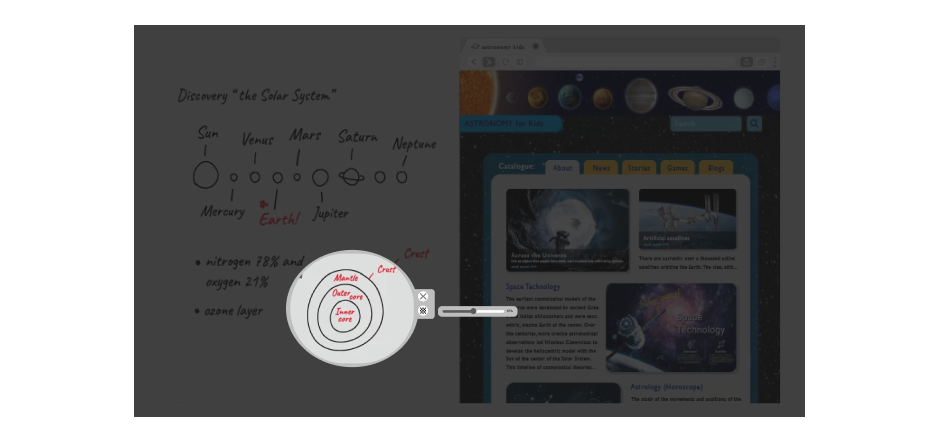
The Spotlight tool offers features to adjust background transparency and spotlight shape. Users can apply it in various scenarios according to their needs. For instance, a chemistry teacher can utilize the Spotlight tool to cover a portion of the periodic table, revealing specific chemical elements for explanation, assisting students in focusing on particular content for learning.
Users can click the transparency icon and adjust the background transparency of the spotlight by dragging left or right. Additionally, users can modify the shape of the spotlight by dragging its boundaries.
LEARNING & TAKEAWAYS

This was my first time designing an educational product, and in this project, I learned three important things.

Designing for Teachers: Simplify for Success

Initially, I mistakenly believed that the interactive design tools created by the teacher should be elaborate to easily grab students' attention. However, the key lies in understanding the user, in this case, the teacher. Most teachers are not tech-savvy, so the products designed for them should meet their specific needs. The interface should be simple, and functionality should not be overly complex. This ensures that even those not well-versed in technology can smoothly integrate the tool into the classroom, fostering greater student engagement.

Considering User Behavior Across Devices in Product Design

Additionally, I learned the significance of considering user behavior on different devices when designing products for cross-device platforms. For example, user interactions on a computer are quite different from those on an interactive electronic whiteboard. Given the large screen of the whiteboard, it's important to design functions at a lower position to ensure smooth usage for users of different heights.

Effective Collaboration and Wireframing: The Key to Efficiency

Lastly, in this project, I realized the importance of real-time team communication and wireframing. As it was my first time designing new features on such a large screen size, I initially lacked clarity on the specifications of the EZWrite product. This led to placing some important functions at the top of the interface. However, as mentioned earlier, such a design could make it difficult for users to operate the buttons easily. Through multiple iterations of wireframing and team communication, we were able to streamline the entire design process more efficiently.

Overall, these learnings have shaped my approach to UX design, and I'm excited to apply them in future projects to explore users need and create thoughtful products.